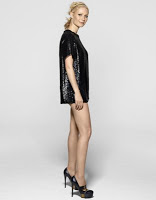
 Just… no. The subscriber’s cover of Harper’s Bazaar featuring Gwyneth Paltrow, is not doing it for me. Do I love her hair and makeup? Yes. I don’t, however, love that she’s wearing a SHIRT sans pants. Look, Gwyn’s got gorge gams… let’s all just pause and appreciate that. But I can SEE her tush cheeks and that is just not okay.
I love a short dress. In fact, the whole of my 18th year was spent in teeny tiny ones, along with shorts with no longer than a 2″ inseam. But even then, I made sure nothing important was “peeking out.” I’d love to see Gywneth’s dress with just an additional inch or two.
 The newsstand cover is MUCH better, IMHO.
What say you?
Photo credits: popsugar.com
 “Ish Don’t Think So” credit: Bruno of Da Ali G Show.
P.S. If you are a web designer or know one, contact me at beautybloggingjunkie[at]gmail[dot]com. I’m in DES need of a redesign!


Is that a dress? Cause i just can tell…how about if she drops something and she needs to pick it up…are panties involved?
Okay…I’m probably alone in this, but I hate it when they do a different cover for subscribers and the newsstand. Many times the subscriber cover is hideous (see Gwyneth) compared to the one non-subscribers get. I feel like I’m being punished or something.
Okay…I’m done ranting now.