One of the greatest things about this blog (other than the fact that it saved me from… oh, a life of MISERY) is that I’m now hip to the happenings of Brits. They reach out to me on a regular to pitch me their stunning English beauty gems like Jelly Pong Pong and Anatomicals and when I go into my analytics, I find that British readership is nearly as high as American. This obviously makes me VERY happy as I have always felt I am British on the inside. Anywhoodle, the point to this rant is that a Harvey Nicks (I always call it that because that’s what Patsy Stone calls it) rep just sent me these fabulous photos of the stores new window scheme. It’s all so Jonathan Switcher from Mannequin, isn’t it?
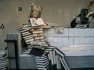
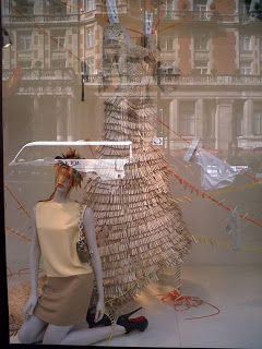
Inspiration for the new windows is taken from the A/W trend understated classics, illustrated on the catwalk shows by designers such as Stella McCartney and Céline.The motif is a celebration of mundane items that are so every day you almost ignore them without noticing their true beauty and design worth.
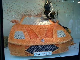
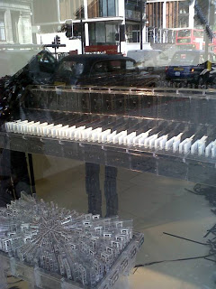
Everyday items are used as the main prop and are made of smaller related items, e.g. a giant hammer covered in nails, a tree made from pencils and a piano made from cassettes. The display is completed using tool boxes, cassette tape and giant nails. The colors used follow suit in mainly neutral tones, the only colors used being hints of yellow and orange.
Janet Wardley, Head of Visual Display for Harvey Nichols says, “Harvey Nichols have used the current trend ‘classics’ and turned it on its head to transform mundane objects into works of art!…expect the unexpected…”
So cool, don’t you think? My fave is the Ferrari made of teeny tiny HORSES.
Like this post? Don’t miss another one! Subscribe via my RSS feed.






Really creative…these windows would definitely make me look twice!